So, you’re sitting down at your computer and preparing your resume for an upcoming job search in respiratory care. You get everything keyed in and then you pause. Should you just go with the type font that automatically came up when you started typing? Or should you choose something else? Will your font choice really make a difference?
Experts in typography believe the type font you use on your resume really does matter. After all, the first thing a hiring manager is going to see when she looks at your resume is the type font. And these days first impressions count because respiratory care hiring managers are often faced with tens, if not hundreds, of resumes for any given job opening.
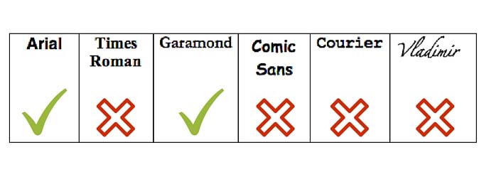
What do the experts recommend? A recent article in Bloomberg Business offered some good advice, which we’ve adapted here to reflect the typefaces most often included with Microsoft Word, the most common word processor.

Times Roman: For a lot of folks, this is the default typeface they see when they open their word processing program. But people in the know about these things say don’t use it, because it sends one message and one message only – old fashioned stodginess. (One typeface expert likened it to wearing sweatpants to an interview.)
Arial: Much better choice. This font and others like it are cleaner and more professional looking. The experts like simple fonts like Arial best because they convey honesty and professionalism without the stiffness of, say, Times Roman.
Garamond: If your resume is spilling over on to page two and you really wanted to keep it to one page without reducing the font size, this font will help squeeze everything on to one page. The nice round letters make for easy reading despite the overall smaller size of the font.
Comic Sans: People love Comic Sans because of its playfulness, but you’re not applying for a “playful” position. Using this font or others like it could make the hiring manager question your commitment to patients who are suffering from respiratory conditions.
Courier: Unless you want your potential employer to think you had to type your resume on a typewriter because you don’t know how to use a computer, this font and those similar to it should definitely be off limits.
Vladimir: Are you applying for a job, or are you sending out your wedding invitations? Flowery scripts like Vladimir are great for the latter, but have no place on a professional resume.
Emojis: What about using the increasingly popular emojis? Interestingly, the Bloomberg article suggested they might actually have a place on a resume. But going back to the premise that hiring managers in respiratory care are looking for serious people capable of putting their all into the care of patients, we’d say don’t go there . . .


